An expensive-looking home rarely depends on one big purchase. The effect stems from a few repeatable signals that people notice quickly: consistent lighting, clean finishes, solid materials, correct scale, and reduced visual noise. When those signals align, a room feels intentional.
Focus stays on upgrades with the highest payoff per effort. Lighting sets the mood and removes harsh shadows. Hardware and plumbing fixtures sharpen details. Paint and trim tighten edges. Brick adds texture and weight. Rugs and curtains fix proportions. Grout, caulk, and aligned switch plates clean up the small stuff that quietly drags everything down.
Use the list as a checklist, pick a handful, then apply the same decisions room to room so the home reads like one plan.
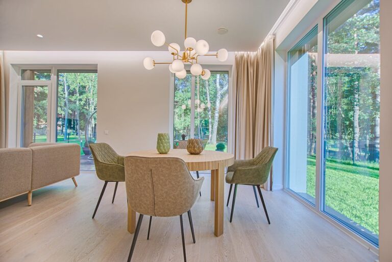
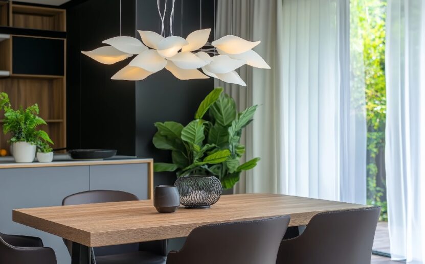
1. Swap Basic Light Fixtures For Statement Lighting
Lighting controls how paint, wood, and textiles register at a glance. A dated ceiling fixture and harsh bulbs flatten the room, even when everything else looks fine.
A single upgraded fixture, paired with a dimmer, changes the whole read of a space because shadows soften and surfaces look calmer.
Where To Start
Entry, dining area, living room, primary bedroom. Those zones define first impressions and evening atmosphere.
One strong ceiling fixture per room usually lands better than several average fixtures, especially when the design language stays consistent.
What Usually Looks High Quality
A fixture with some visual weight, a shade or diffuser that hides glare, and warm bulbs that keep wall color pleasant. Finishes matter less than consistency. Pick one main metal finish in a room and repeat it once or twice, so the choice feels intentional instead of random.
A placement note that saves people often: center the fixture on the furniture zone, not the empty center of the room. Dining pendants should sit over the table. Living room fixtures should support the seating area.
Quick Buying Checklist
- Dimmable fixture plus compatible dimmer
- Bulbs with warm light
- Scale that suits the ceiling height and room size
- Shade material that prevents bare bulb glare
2. Use Bricks For Texture And Character

Brick adds a sense of permanence. Texture also helps a room feel finished because the eye gets something structured to land on.
One brick surface can do the job, as long as the surrounding walls stay calm.
Best Places For Brick
Fireplace surround, a short accent wall behind a sofa or bed, a limited backsplash zone behind a range, or an entry niche.
Keeping it to one main brick moment usually avoids the cafe set feeling.
Brick Floor Tile And Veneer Options
Full brick construction rarely makes sense indoors. Thin brick veneer gives the look with less structural complexity, and proper mortar joints matter more than any brand name.
For floors, brick floor tile can add weight and warmth, especially in an entry, mudroom, or kitchen.
The best results come from restraint: a simple grout color, a clean edge detail at transitions, and a matte finish that avoids a plastic shine.
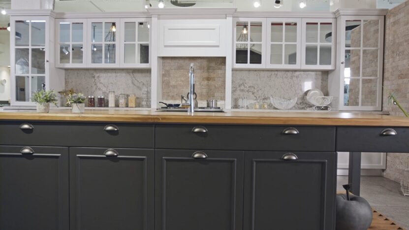
3. Upgrade Hardware: Handles, Knobs, Faucets, Switch Plates
Hardware sits at eye level and hand level, so it shapes the quality signal every day. When pulls feel light, finishes mix without a rule, or switch plates look tired, the whole room takes a hit.
What To Upgrade First
Kitchen cabinet pulls and knobs, then the main bathroom faucet and shower trim, then door handles in main living areas.
Switch plates and outlet covers come last, yet they make paint jobs look finished.
Finish And Layout Rules That Keep It Clean
One dominant finish per room creates calm. Two finishes can work when the rule stays strict and repeated, like matte black plus warm brass used in planned places.
Keep hardware heights consistent on doors and drawers, and measure existing hole spacing before ordering so replacements land cleanly.
The Small Detail That Adds Quality
Choose hardware with solid weight and a clean profile. Heavy, simple shapes tend to look more expensive than ornate shapes made from thin metal.
4. Paint With A Consistent, Modern Color Palette
Paint does more than change color. It sets the background that every finish and object reacts to. When colors shift randomly from room to room, the home feels fragmented.
A limited, consistent palette makes even modest spaces feel planned.
How To Choose Colors That Hold Together
Start with one main wall color, then adjust tone or depth slightly for secondary rooms. Soft neutrals, warm whites, muted grays, and desaturated earth tones tend to age better and support different materials.
Strong colors work best when used intentionally, such as on one wall or in a smaller room.
Light also decides success. North-facing rooms often need warmer tones. Bright rooms can handle cooler or deeper shades.
Testing paint on large samples helps avoid surprises once the walls are fully coated.
5. Add Crown Molding And Simple Trim Details
Trim creates structure. Without it, walls can feel unfinished, even when paint looks good.
Crown molding, baseboards, and simple casing help define transitions and make ceilings and openings feel deliberate.
@therenegadehome Can you tell it’s not real? 👀 #diyhacks #homehack #easydiy ♬ Mrs Magic (Strings Version) – Strawberry Guy
Where Trim Matters Most
Ceiling lines, door and window frames, and baseboards. Crown molding does not need to be ornate.
Simple profiles often read more modern and more expensive than decorative ones.
Proportion Over Decoration
Scale matters. Taller ceilings can handle deeper crown molding. Standard ceilings benefit from slimmer profiles.
Consistency from room to room helps the home feel cohesive, even when layouts differ.
Paint trim in one consistent color throughout the home whenever possible.
6. Replace Cheap Window Coverings With Proper Curtains Or Shades
Windows frame the room. When coverings look thin or undersized, the whole space feels temporary. Proper window treatments improve proportion, control light, and add softness.
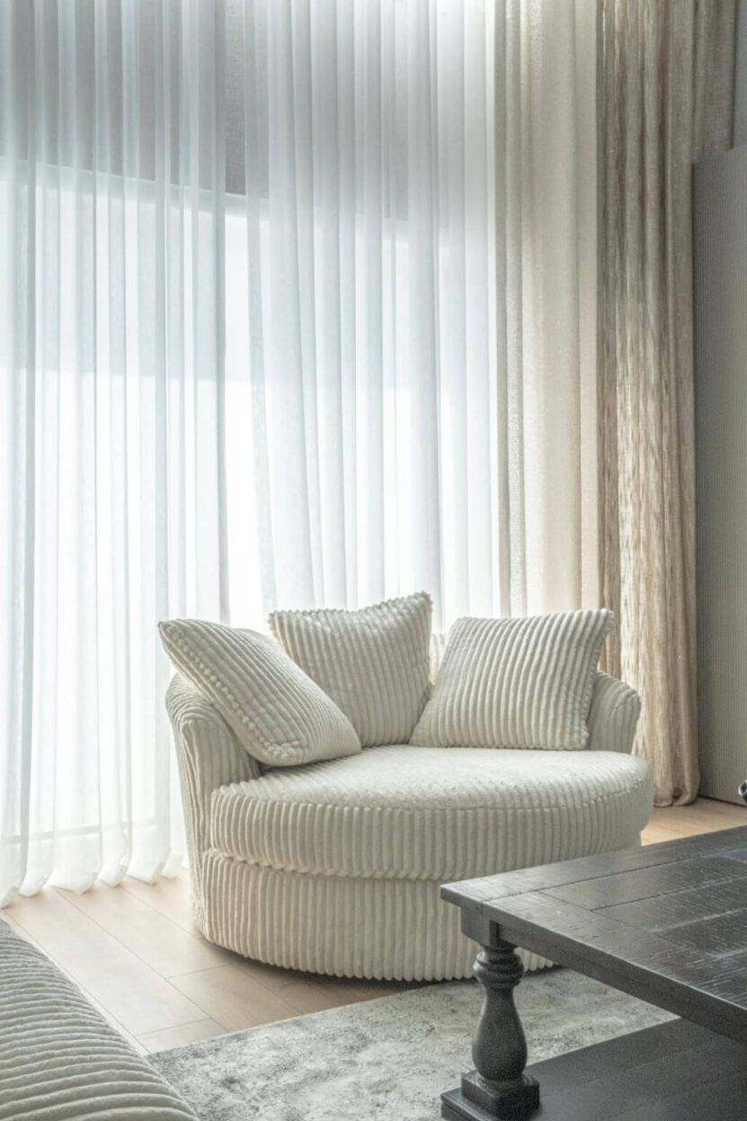
What Makes Window Treatments Look Right
Curtain rods should sit higher and wider than the window frame, so the window feels larger and the ceilings feel taller.
Panels should reach the floor and have enough width to look full when closed.
Choosing Materials And Styles
Simple fabrics like linen blends, cotton, or textured neutrals age well. Roller shades, Roman shades, or tailored curtains tend to look cleaner than busy patterns.
Match hardware finish to nearby metals so nothing feels accidental.
7. Layer Lighting Instead Of Relying On One Source
One ceiling light flattens a room. Multiple light sources add depth and make spaces usable at different times of day. The goal stays simple: light from more than one height.
How To Build A Layered Setup
Ceiling light sets the general brightness. Table and floor lamps handle reading and seating zones.
Accent lighting highlights texture, art, or architectural details.
Each layer works better when connected to dimmers or separate switches, so light levels adjust without effort.
8. Add One Large, High-Impact Mirror
A single large mirror does more work than several small ones.
It reflects light, extends sightlines, and adds a sense of scale that smaller decor pieces never reach.
9. Use Larger Rugs That Fit The Room Properly

Rug size decides whether furniture feels anchored or scattered. Small rugs make rooms look cheaper because everything floats.
In living rooms, the front legs of sofas and chairs should sit on the rug. In dining rooms, chairs should stay on the rug when pulled out. Bedrooms benefit from rugs that extend well beyond the bed sides.
10. Style With Fewer, Larger Decor Pieces
Too many small objects create visual noise. A room starts to look curated when decor choices slow down and scale increases.
One strong piece gives the eye somewhere to rest. Several weak pieces do the opposite.
Anchor each surface with one primary object, then stop. A large ceramic bowl, a sculptural vase, a substantial lamp, or a framed print with presence usually works better than a cluster of small items.
Negative space plays a role here. Empty areas signal confidence and control.
Objects with weight, texture, or simple geometry tend to age well. Natural materials like stone, ceramic, wood, or metal feel grounded.
Color stays calmer when the backdrop already carries enough interest through materials and light.
11. Upgrade Door And Cabinet Finishes
Doors and cabinets cover a lot of visual ground. When finishes look tired, chipped, or overly glossy, the entire room takes a hit.
A refresh here often delivers more impact than replacing furniture.
Paint And Surface
Paint can change everything when applied carefully. Matte or satin finishes usually read cleaner than high gloss.
For cabinets, proper prep matters more than the paint brand. Clean surfaces, light sanding, and patience between coats decide the result.
Wood veneer panels or simply applied molding can also elevate flat doors. Subtle detail beats decorative excess.
12. Add Built-In Looking Storage
Storage that looks planned always reads higher quality than standalone pieces dropped into a room.
Built-in looking solutions help control clutter and improve proportions.
Where It Makes Sense
Living room shelving, hallway cabinets, bedroom wardrobes, or a simple bench with storage in the entry.
Even modular systems can look built in when fitted wall to wall and painted to match the walls.
The Bottom Line
You can make a home look expensive by tightening the basics that people notice first.
Upgrade lighting, keep paint colors consistent, and use one finish direction for metals.
Add one strong texture moment with brick or brick floor tile, then fix proportions with properly sized rugs and window treatments.
Focus on clean edges, tidy surfaces, and a small set of upgrades done well, room by room.